.png)

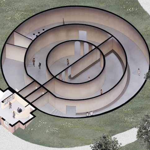
Mapping Nature exhibition at RADIUS by artist Esther Kokmeijer (2023).
Delft, The Netherlands
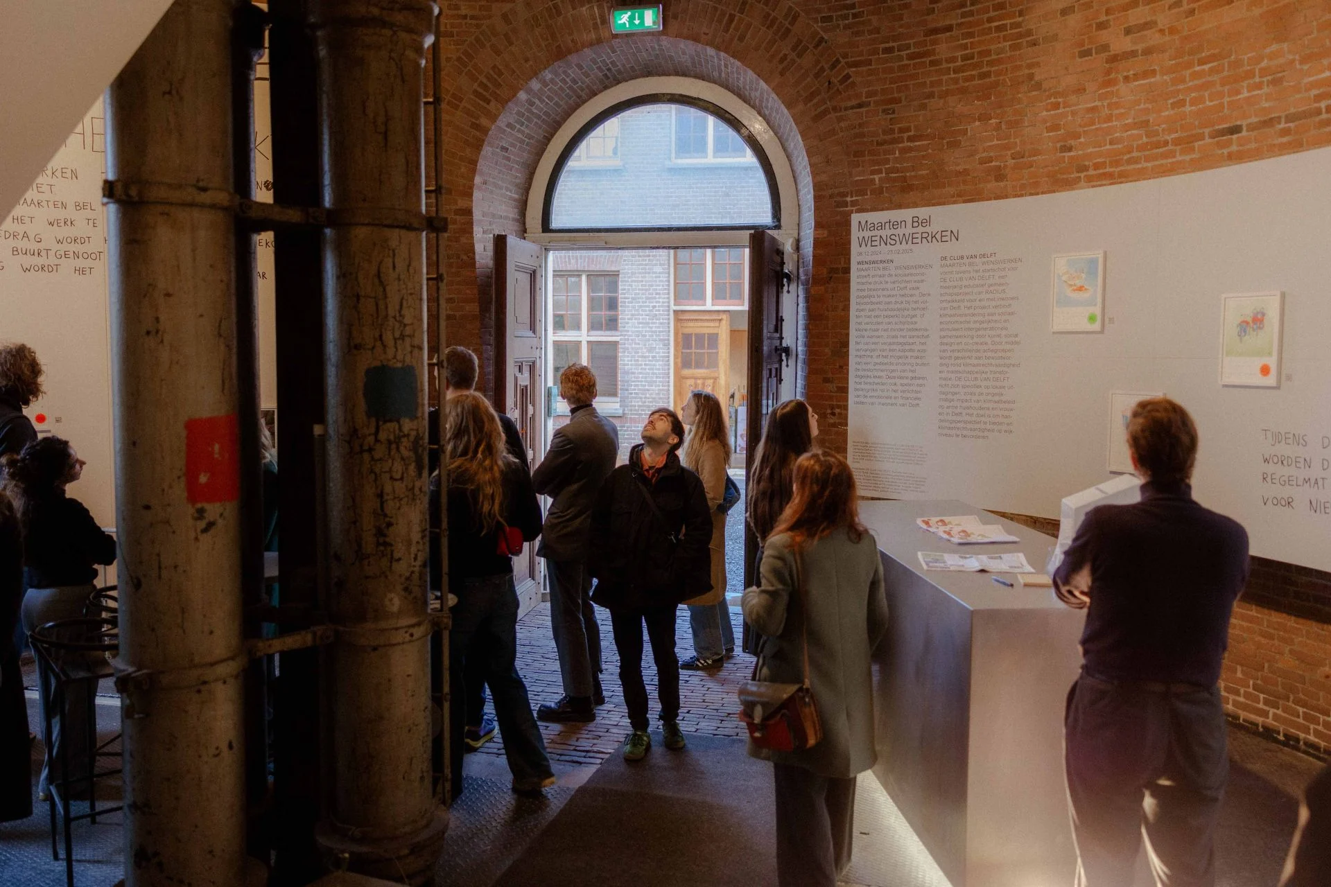
RADIUS - Center for Contemporary Art & Ecology
Product Design | UX Design
Design & Research
4 months | 2023
The project reimagines how visitors engage with contemporary ecological art inside RADIUS — one of the Netherlands’ most conceptually rich yet cognitively demanding exhibition spaces.
Grounded in extensive UX research, the project introduces a dual-mode digital knowledge companion that supports visitors before, during, and after their museum experience — reducing cognitive friction, expanding accessibility, and strengthening RADIUS’ emerging identity as an ecological knowledge center.
✺ Led end-to-end research including interviews, field observations, hot-zone mapping, and jargon comprehension analysis;
✺ Synthesized cross-method insights into strategic design opportunities;
✺ Defined the product vision and created the dual-mode interaction model (IN-RADIUS / OUT-RADIUS).
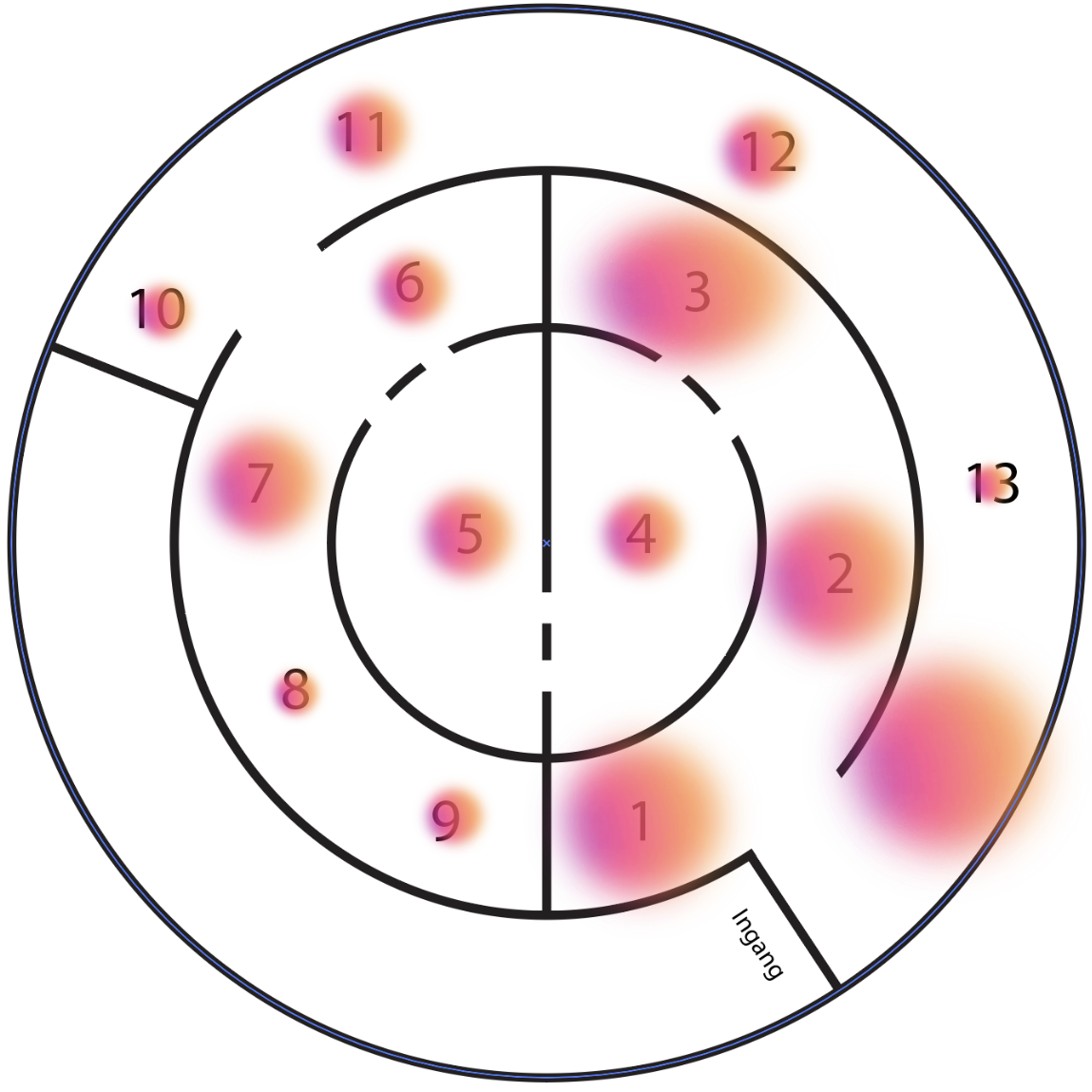
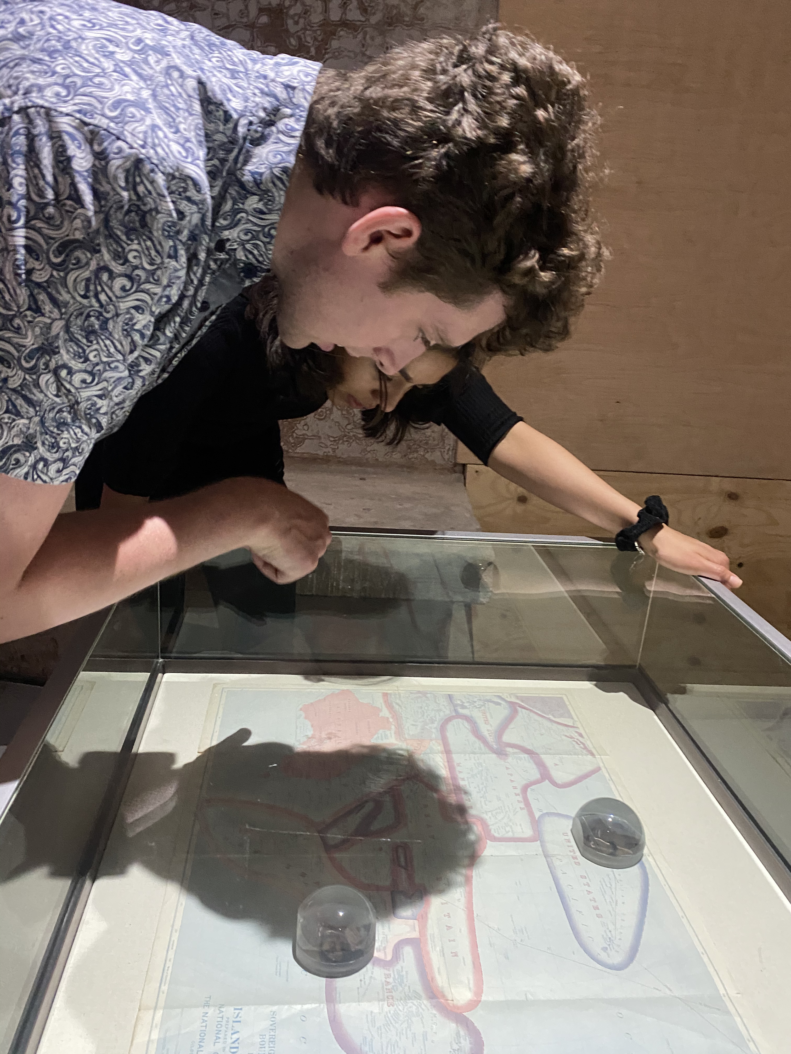
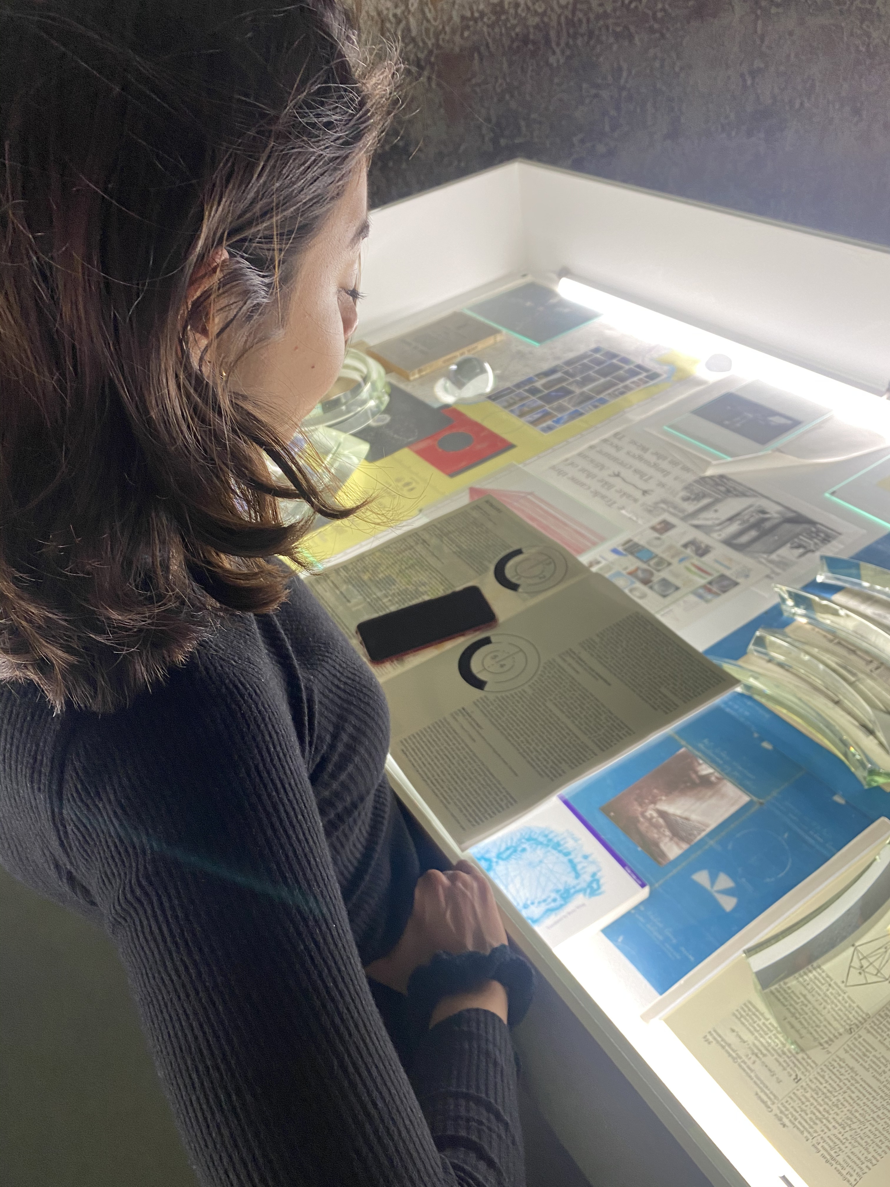
RADIUS sits at an interesting crossroads: the exhibitions are conceptually rich and intentionally layered, yet the visitor base has broadened from only receiving academics and experts in the field, to include people with varying levels of familiarity with ecological and socio-political topics. This shift created a new tension: the depth that experts appreciate can make it harder for newer audiences to stay oriented and engaged.
Visitors consistently experienced:
✺ A strong start, followed by rapid engagement decay midway through the exhibition;
✺ Confusion triggered by scientific and socio-ecological jargon, leading to disengagement;
✺ Overwhelm caused by dense text formats and long-form video installations;
✺ Lack of interpretive guidance, which left visitors feeling uncertain, not curious.
At a strategic level, RADIUS needed to evolve from a space that assumes literacy, into a space that builds literacy.
Hence, this presents the following opportunity:
_page-0001.jpg)
Chosen to understand how visitors interpret the exhibitions and where background knowledge shapes comprehension.
Used to identify where visitors naturally slow down, speed up, or lose engagement across the exhibition space.
Selected to capture real visitor behaviours and subtle friction points that are not always expressed verbally.
Implemented to quantify how familiar visitors are with key ecological terms and to pinpoint which jargon creates confusion.
1
Engagement naturally declines over time — visitors start curious but lose momentum mid-way.
2
Confusion is a major drop-off point — once visitors feel lost, re-engagement is unlikely.
3
Current tools don’t fully support comprehension — the booklet, signage, and spatial flow left some visitors uncertain about what to focus on.
4
Interaction strengthens understanding — discussing artworks or reflecting in the moment improves comprehension.
5
Visitors want a sense of direction — gentle guidance helps them stay anchored in the narrative of the exhibition.
6
The Antarctica exhibition consistently stands out — clearer storytelling and stronger emotional impact increased engagement.
7
Visitors read all available text — but the density and complexity often exceed their cognitive capacity.
8
Aesthetics strongly affect the experience — visual quality shapes both mood and comprehension.

This survey results visualizes how familiar visitors are with the terminology used across RADIUS’ exhibitions. The results reveal a clear divide: commonly used ecological and socio-political terms such as carbon neutral, sustainable development, and greenwashing scored high in familiarity, while more specialized or academic concepts like petrosubjectivity, epoch, Anthropocene, and intersectionality showed low recognition.
These findings directly informed the need for clearer definitions, a structured glossary, and just-in-time explanations within the design solution.
With the research insights clarified, I translated the key experience gaps into a set of focused How Might We questions. These prompts helped frame the design space around the core challenges observed at RADIUS:
✺ How might we keep visitors engaged from start to finish?
✺ How might we make the experience at RADIUS feel personal?
✺ How might we avoid confusion in visitors while visiting RADIUS?
✺ How might we incentivize discussion and interaction between visitors?
✺ How might we make users feel guided throughout their visit to RADIUS?
To explore solutions systematically, I used the Lotus Flower technique. This method was chosen for its ability to quickly expand the range of possibilities while keeping ideation anchored to user needs.
From the broader idea landscape, I clustered the strongest ideas into a consolidated direction, and created the final design concept.


.png)
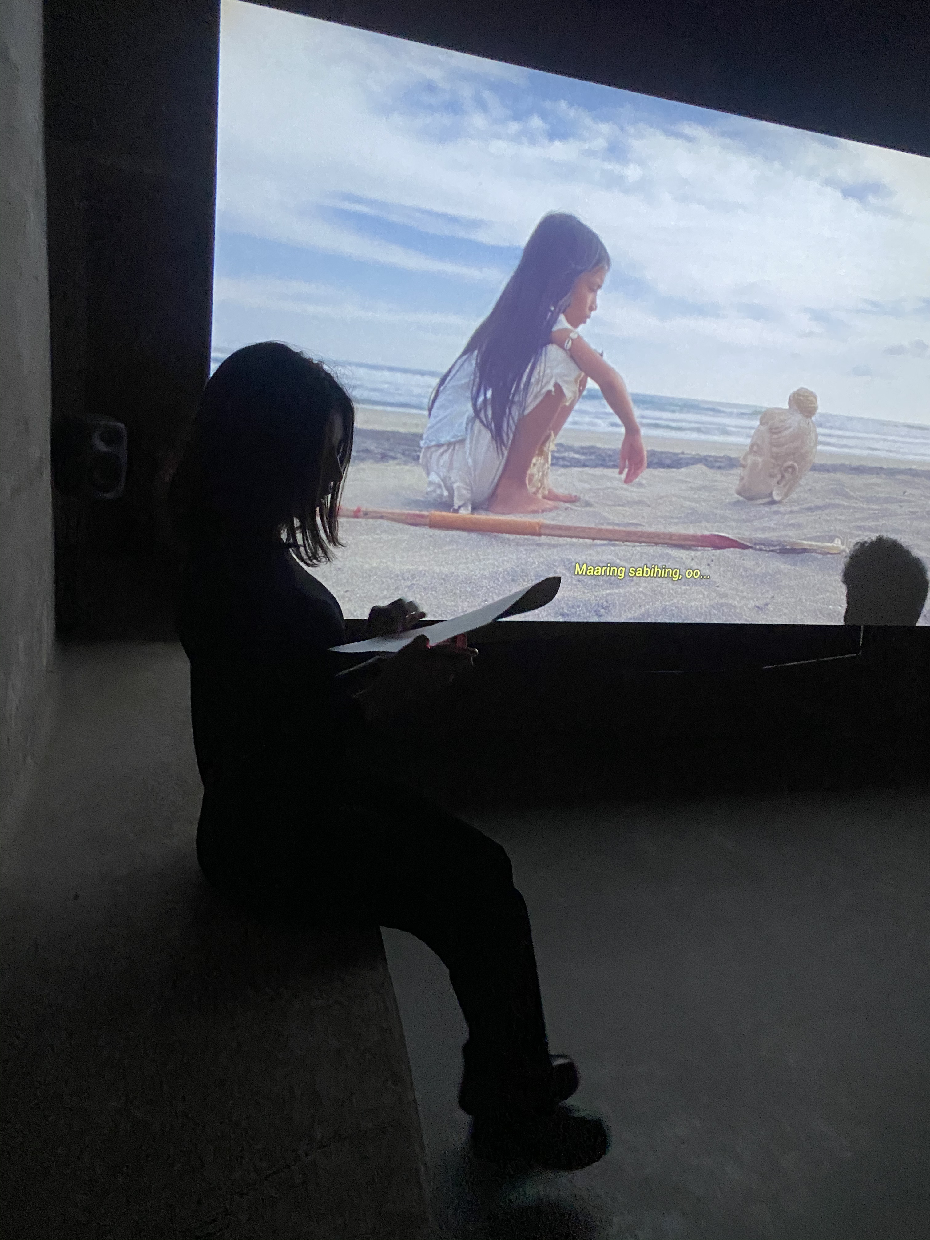
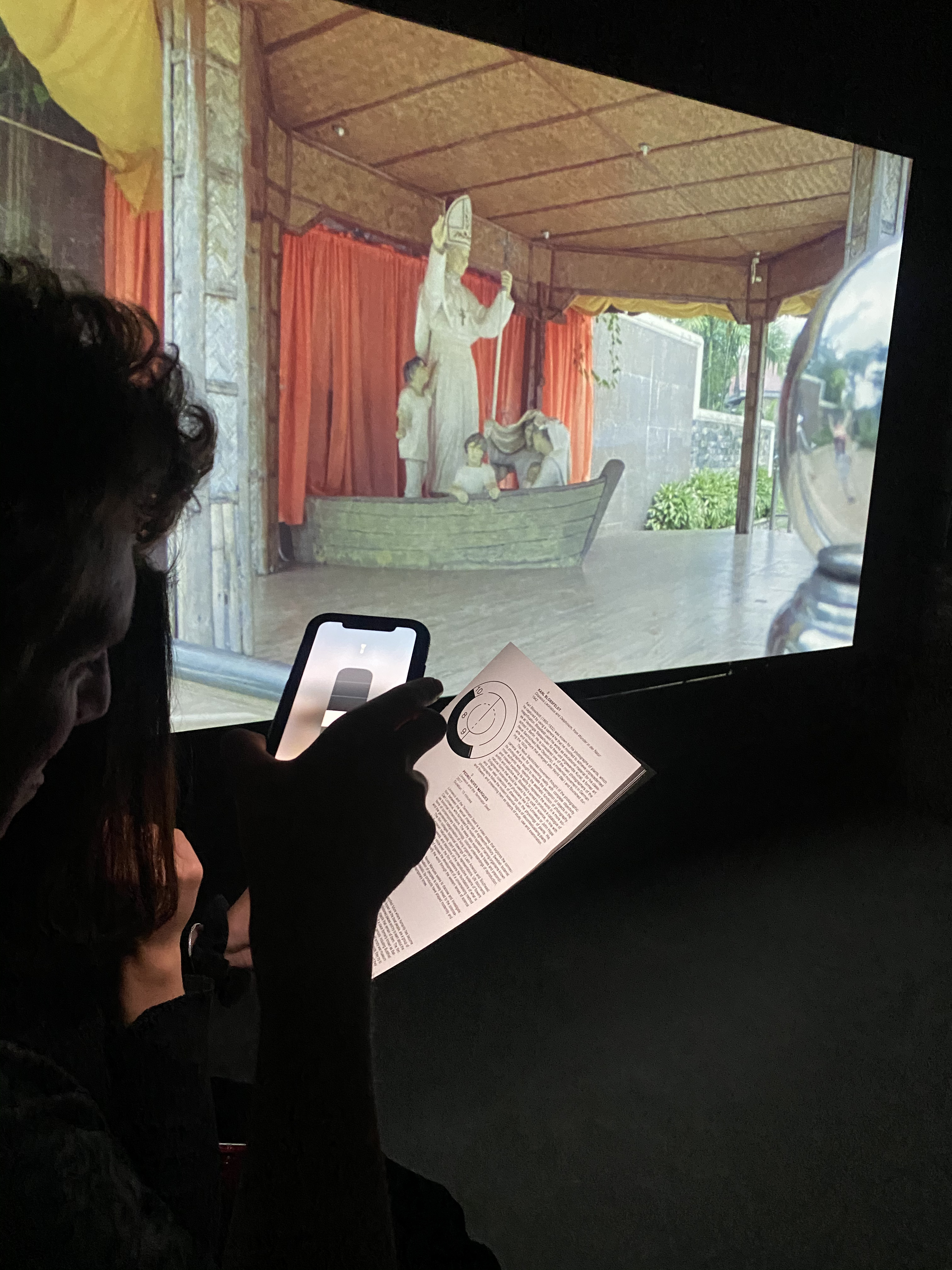
The RADIUS App was conceived as a way to make the complexity of the exhibitions more approachable without changing the curatorial intent. It acts as a lightweight companion that meets visitors at different moments of their journey.
✺ Before the visit: the app helps set the context—offering previews, calendars, and artist insights that ease newcomers into the themes.
✺ During the visit: it provides support by offering clear definitions for terminology, deeper background on artworks, and notepad prompts for in-the-moment reflection.
✺ After the visit: it keeps the experience open, allowing visitors to continue exploring, questioning, and participating in community discussions at their own pace.
The decision to design a before–during–after experience emerged directly from the research: visitors encounter friction at multiple points in their journey, not just inside the exhibition. Some arrive without enough context to feel confident, others lose orientation mid-way, and many leave with questions or a desire to keep exploring.
These needs are interconnected, and addressing only the on-site moment would have treated symptoms rather than the underlying patterns shaping engagement. A three-phase experience allowed the solution to prepare visitors with foundational knowledge beforehand, offer timely support and clarity during the exhibition, and extend reflection and learning afterward.
.gif)
A big realization from this project was understanding that visitors don’t disengage because they lack interest in ecology or contemporary art. Rather, they disengage because the experience demands a level of orientation and conceptual literacy that not everyone arrives with. Designing the RADIUS App made this clearer: the barrier was never curiosity, but access. A space that aims to function as a knowledge center must meet visitors where they are, not where we assume they are.
This project reminded me that designing for cultural spaces is ultimately about designing for interpretation. The goal is not to simplify the content or impose a narrative, but to give people enough structure to make meaning on their own terms.
I see this prototype as a step toward that: a way to turn RADIUS’ conceptual depth into something more navigable, more personal, more open. If anything, it reinforced my belief that design’s role in the arts is not to mediate the work, but to remove the friction that prevents people from engaging with it fully.
~ Daniella de Rijke Rodríguez, July 2023.
Moving is consistently listed as one of the most stressful life events in the United States. MoveShepherd brings logistics, communication, and trust into a single platform, simplifying the experience for both customers and providers.